
How to Translate Product Benefits into Visual Hooks
Learn how to visually express beauty product benefits like matte, long-wear, and hydration through design, motion, and texture for impactful brand storytelling.
20 Jun'25
By Niharika Paswan


How to Translate Product Benefits into Visual Hooks
Beauty is more than what meets the eye, but what meets the eye often makes or breaks the first impression. That’s especially true in an industry where visuals do more than just showcase products. They explain them. They turn claims like "long-wear" or "hydrating" into ideas people can see, feel, and remember.
And with modern consumer attention spans shrinking by the second, having the right visual cues isn’t just creative flair, it’s strategic currency. So how do brands translate their product benefits into visual hooks that stick?
This article is your practical guide to doing exactly that. Whether you're designing a launch campaign for a new foundation, crafting animations for a skincare serum, or planning packaging that conveys a unique finish, we’ll walk through how to make product USPs visible, believable, and magnetic, without saying a word.
Why Visual Hooks Matter
Think about this: your product has just a few seconds on someone’s screen. Maybe even less on a shelf. In that blink, the viewer needs to understand what makes your product worth their time. Words help, but visuals carry weight.
Visual hooks are not just about being pretty. They're tools of communication. They make technical claims intuitive. They speak to emotion, to logic, and to beauty aspirations. The best visual storytelling in beauty is always rooted in real product performance, and designed to show, not tell.
Common Beauty Claims and How They Can Be Visualized
Here’s a breakdown of some popular claims in the cosmetics and skincare world, and smart ways brands can turn those claims into compelling visuals.
- 1. Matte Finish
What It Means: No shine, oil control, smooth texture
Visual Cues:
•Powdery backgrounds
•Blurred or fogged lens effect around subject
•Before-and-after with light reflection controlled
•Velvet or suede textures in the scene
•Minimalistic lighting to emphasize skin clarity
Pro Tip: Use soft lighting on textured paper to mimic the feel of matte skin. A side-by-side skin swatch with glossy vs matte finishes works great in motion assets.
- 2. Long-Wear or 24-Hour Hold
What It Means: Durability across time, resistance to sweat, touch, movement
Visual Cues:
•Clock/time-lapse animations
•Stains that don’t fade when rubbed
•Simulated weather resistance, rain, humidity
•Strong, clean graphic lines that don’t smudge
•Split-screen of early vs late-day wear
Pro Tip: Sweat-test reels or transformation videos are perfect for TikTok. For static campaigns, use endurance metaphors like marathon ribbons, hourglasses, or digital clocks.
- 3. Hydration or Moisture Boost
What It Means: Skin nourishment, water retention, glow
Visual Cues:
•Water droplets, misting effects
•Dewy skin texture close-ups
•Rippling water or jelly textures
•Cooling colors like blues, silvers, and soft greens
•Transparent or glossy materials in props and packaging
Pro Tip: Layer macro shots of gel-like product textures with reflections of water to emphasize moisture. Don’t underestimate the power of sound design in motion, dripping or flowing water adds emotional weight.
- 4. Plumping or Volume
What It Means: Fuller lips, cheeks, or skin bounce
Visual Cues:
•Balloons, bubbles, or inflating animations
•Before-and-after showing increased surface volume
•Rounded shapes, soft gradients, and lifted highlights
•Gloss textures with light hotspots
•Slight motion distortion or lens bloom
Pro Tip: Avoid overdoing the visuals. Plumping should feel luxe, not cartoonish. Subtle animation works better than literal inflating objects when targeting mature audiences.
- 5. Anti-Aging or Firming
What It Means: Reduced fine lines, tightened skin, youthful glow
Visual Cues:
•Light beams pulling upward
•Smoother transitions in before-and-after animations
•Golden hour lighting to represent vitality
•Abstract visuals like time reversal or nature rebirth
•Textured silk or satin props to imply refinement
Pro Tip: Combine macro shots of wrinkle-reduction with metaphoric shots, sunrise, blooming flowers, or melting ice reversed. These tell the story emotionally as well as logically.
- 6. Clean Beauty or Dermatologically Tested
What It Means: Non-toxic, skin-safe, responsible formulation
Visual Cues:
•Neutral backgrounds, soft-focus lens
•Botanicals, lab glassware, ingredient close-ups
•Natural skin without makeup
•Beige, green, and white tones in props and wardrobe
•Icons or infographics overlaid (in motion) to guide consumers
Pro Tip: Balance between science and nature. If using lab visuals, soften the look with natural lighting or organic motion. If going botanical, keep it elevated, not rustic.
Tools for Turning Claims Into Visual Language
Understanding how to translate benefits visually is part strategy, part storytelling, part production. Here's how to bring it all together.
- 1. Work Backwards from Your USP
Don’t start with a shot list. Start with your product’s one-liner. Ask:
What does this do better than anything else?
How does it make someone feel?
What transformation is the customer expecting?
Let this core benefit guide everything from lighting to prop selection.
- 2. Use Material Metaphors
Texture, shape, and movement in physical materials often express product claims better than abstract ideas. A melting ice cube shows refreshment. A rubber band snapping back shows elasticity. Foam cushions can symbolize softness. These metaphors help consumers instantly connect the dots.
- 3. Play with Contrast
Contrast is a powerful storytelling device. In beauty campaigns, it helps clarify benefits quickly:
Dry vs hydrated skin
Oily vs matte finish
Uneven vs even tone
A clean, side-by-side visual does more work than ten lines of copy.
- 4. Motion Brings Proof
Especially on social platforms, motion assets shine. Animation can simulate absorption. Slow-mo can highlight shimmer. Time-lapse can prove longevity. Even subtle movements like blinking lights or dripping textures tell stories that stills can’t.
- 5. Texture is Everything
In beauty, texture sells. Whether it’s the mousse-like swirl of a foundation or the glassy finish of a serum, showing texture makes performance feel real. Use macro lenses. Use tactile props. Use hand gestures. Let viewers imagine how it feels.
- 6. Choose Your Color Palette Intentionally
Colors aren’t just pretty, they communicate.
Blue = hydration, calm, tech-forward
Pink = softness, approachability, skin health
Gold = luxury, efficacy, transformation
Green = nature, safety, wellness
Use these tones across props, lighting, and backgrounds to reinforce your product’s benefit.
- 7. Don’t Forget Packaging Your visual hook should carry through to your packaging design. A product that promises matte coverage shouldn’t come in shiny packaging. A “plumping gloss” might use inflated fonts, gloss UV finish, and round caps. Align your physical design language with your claims, it builds trust and brand clarity.
Turning Technical Claims into Creative Visuals - Seamlessly
At Admigos, we bridge the gap between what your product does and how it looks. We know that today’s consumers aren’t just buying a lipstick or a serum, they’re buying into a promise. That promise needs to show up in every scroll, click, or shelf glance.
Our team specializes in taking product benefits and translating them into visual stories that resonate. You give us the science, the data, the claim, and we’ll craft the creative that makes it compelling. Whether that’s a matte animation, a hydration hero reel, or a time-lapse for long-wear, we deliver visuals that move people and prove performance.
From storyboard to delivery, Admigos simplifies the technical-to-visual transition, because your product deserves to be understood at first glance.
Final Thoughts
Beauty is detail-driven. It’s full of promises, smoother, brighter, longer-lasting, more radiant. But in a world where visuals do the talking, how you show those promises can define your brand’s success.
Translating product benefits into visual hooks isn’t about gimmicks. It’s about clarity. It’s about emotion. And it’s about design that helps people believe what you’re saying, because they can see it.
As a brand, when you master this translation, you’re not just selling, you’re connecting. You're giving your audience something they’ll remember and trust, long before they ever read the label.
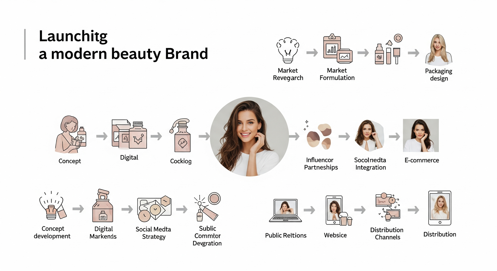
From Idea to Launch: Visual Workflow for Modern Beauty Brands
Discover how modern beauty brands streamline visual workflows from concept to launch, covering pre-prod, production & post for flawless product launch visuals.
“Reels vs. Static for Beauty: What’s Working in 2025”
Discover what’s working for beauty brands in 2025. Explore the impact of reels vs static posts, and how the best content formats drive reach, trust, and conversions.
