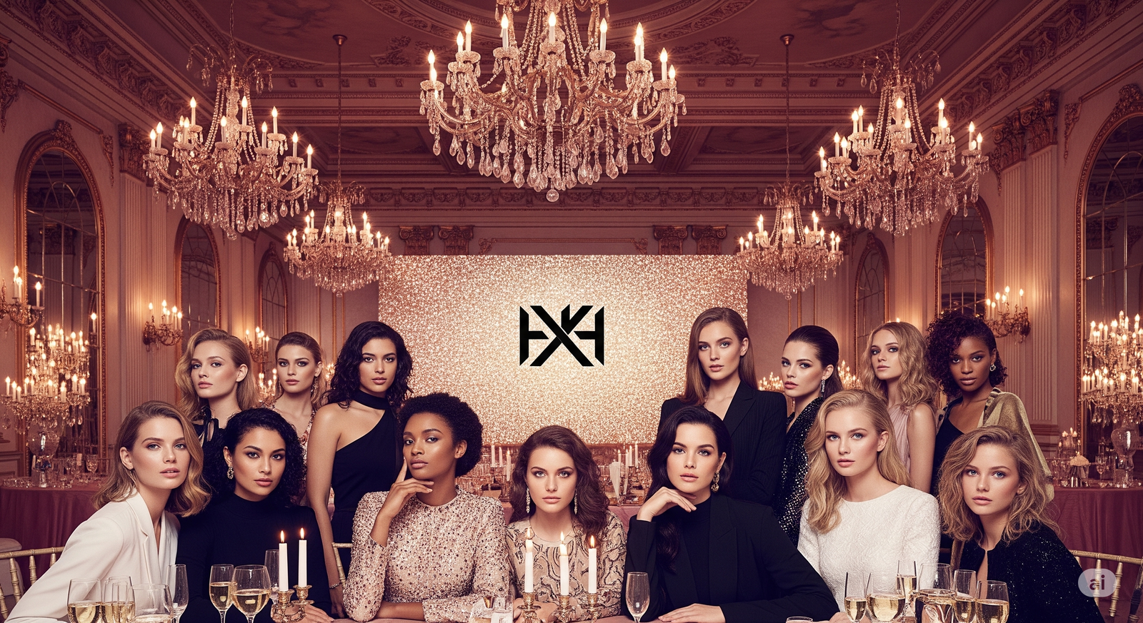
The Visual Science Behind Beauty Packaging That Sells
Explore the visual psychology behind beauty packaging strategy and learn how to design packaging that sells both online and offline for stronger brand impact and conversions.
01 Jul'25
By Niharika Paswan

The Visual Science Behind Beauty Packaging That Sells
You never get a second chance to make a first impression and in beauty, that impression often happens on a shelf, a scroll, or a swipe. Before anyone reads the ingredients, checks the claims, or swatches the shade, they’re judging one thing: the packaging.
Packaging is the first piece of visual branding your audience sees. It speaks for the product before anything else does. A great beauty packaging strategy isn’t just about looking pretty, it’s rooted in psychology, design science, and emotional behavior. The best packaging doesn’t just house the product. It sells it.
This article breaks down how packaging influences buyer perception, what design cues drive conversions, and how to go from a pretty pack to a high-performing sales tool. If you're building a D2C brand or prepping a rebrand, here's your blueprint for creating packaging that sells: visually, emotionally, and functionally.
Why Packaging Still Sells in a Digital-First Market
Even in an e-commerce world where we buy with a click, packaging holds surprising weight. Here’s why:
- Perception of value: A heavier bottle, a matte cap, an embossed label, these small decisions change how we price a product in our mind.
- Trust & legitimacy: New brands gain credibility fast through sharp packaging design. Sloppy execution? It reads as unprofessional or low quality.
- Memory & recall: Packaging design, especially unique color combos or shape, improves visual recall and repeat purchases.
Your product could be magic, but if the packaging feels off, sales will stay flat. Strong beauty packaging strategy starts with visual cues that align with how people buy beauty.
The Psychological Drivers of Packaging That Sells
Let’s unpack the science behind what works.
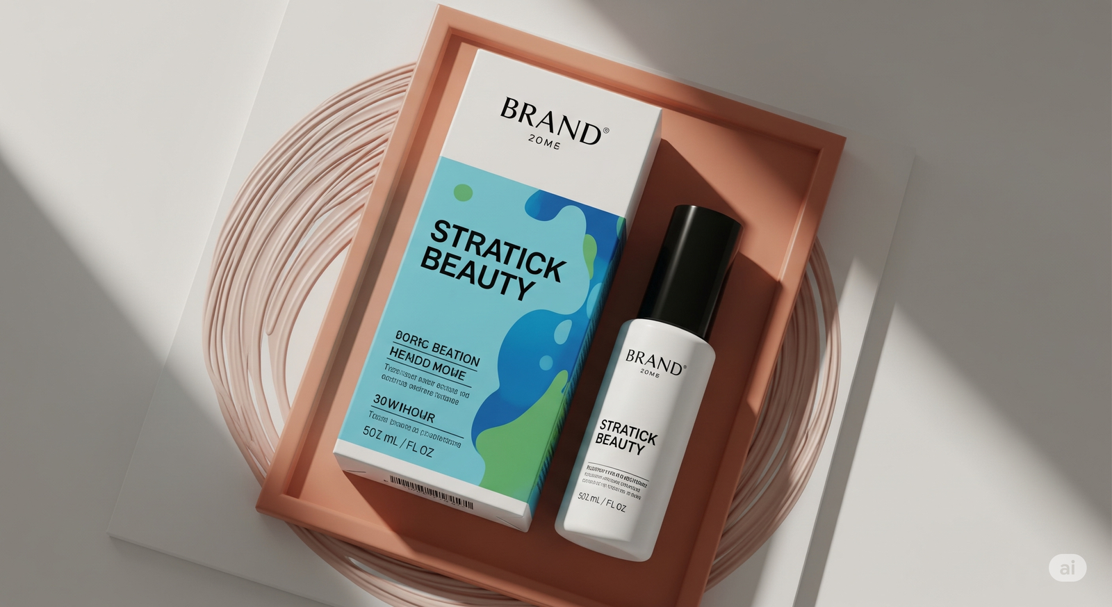
1. Color Psychology

Colors signal emotion. In beauty, they also suggest product category and price point.
- Nudes & neutrals = clean, natural, gentle (often skincare and minimal makeup)
- Pastels = softness, playfulness, youth (used for blushes, glosses, niche skincare)
- Black or gold = luxury, boldness, edge (frequent in fragrance and pro makeup lines)
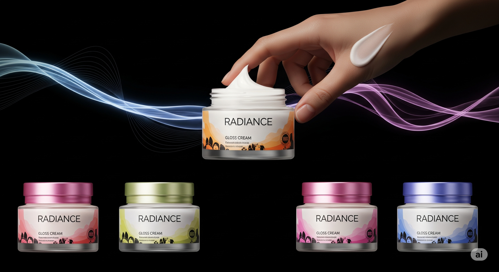
- Color-coded SKUs = immediate visual navigation (shades, variants, functions)
A smart beauty packaging strategy uses color not just for appeal but to guide decision-making.
2. Shape & Ergonomics
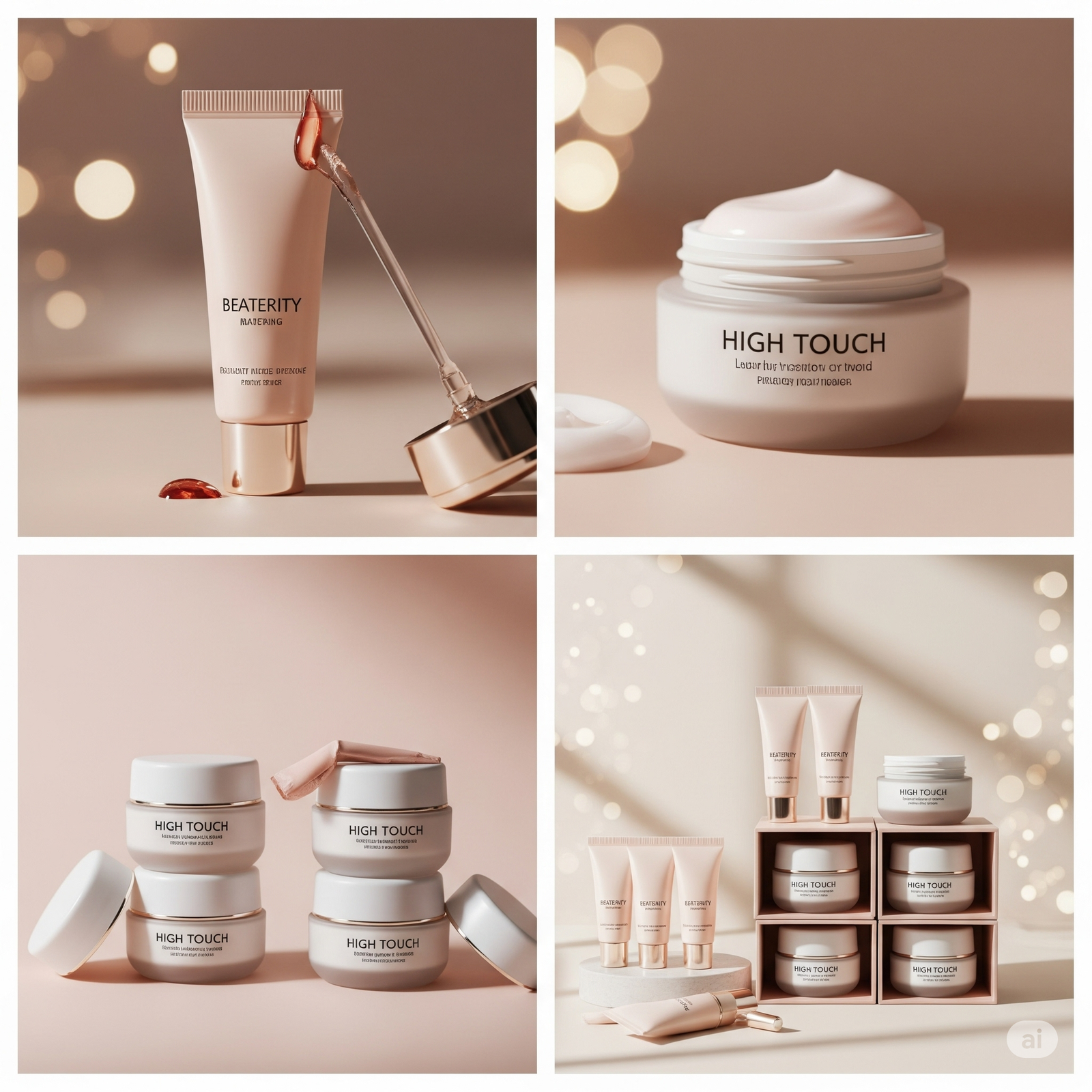
The way a product feels in hand influences how users perceive its quality. Stiff caps, clunky bottles, or unbalanced weights can make something feel cheap, even if the formula isn’t.
In digital shopping, unique shapes also help a product stand out in a flatlay or PDP.
Consider:
- Tubes that taper elegantly for precision
- Rounded jars that feel soft and high-touch
- Modular designs that stack or store easily
Design form = perceived function.
3. Typography & Copy Hierarchy
People skim. Fast. Your label’s font and layout decide what they learn in the first glance.
- Serif fonts = trust, heritage, science
- Sans-serif fonts = modernity, cleanliness
- All caps = attention, boldness
- Script = femininity, softness
Smart packaging shows 3 things fast:
- What it is
- What it does
- Why it’s different
The packaging that sells doesn’t overwhelm. It guides attention with structure and clarity.
Where Packaging Fails (And Why Sales Dip)
Even great formulas flop when the design falls into one of these traps:
1. Overdesigning Without Focus
Too many fonts, too much information, too many textures. This creates cognitive overload. Instead of standing out, your product blends into the noise.
Minimal design with sharp focal points often converts better.
2. Mismatch with Audience Expectation
A neon lip tint for Gen Z in a heritage-style tin? Confusing. A clinical serum for sensitive skin in a candy-colored bottle? Feels like a gimmick.
Your beauty packaging strategy should match the buyer’s taste and the product's promise.
3. Ignoring Functional Flow
If a lid doesn’t close smoothly, the label peels, or the pump jams, it erodes trust. Packaging is part of the product experience, and poor UX leads to bad reviews, no matter how effective the formula is.
Digital Twist: Packaging That Performs Online
Today, packaging isn’t just about shelf appeal. It has to work across:
- PDP mockups
- Social video content
- Unboxing reels
- 3D product viewers
- AR try-ons
Which means your packaging needs:
- Strong edges and shapes for 3D animation
- Print finishes that photograph well under natural and flash lighting
- Consistent branding across sizes, bundles, and sample kits
Packaging is no longer a static object. It’s a digital asset.
Motion-Driven Packaging That Converts: Admigos
At Admigos, we help brands translate packaging into visual experiences that live beyond the shelf.
We bring beauty packs to life using motion, animation, and 3D, turning your packaging into scroll-stopping reels, interactive PDP loops, and immersive web modules.
Whether it’s spinning lipstick bullets, shimmering serums in animated drips, or ingredient overlays in 3D, we help your packaging do more than sit pretty.
We turn packaging into performance content. Admigos project.
Packaging That Sells: Visual Best Practices
Want your next product to fly off digital shelves? Make sure your packaging visuals hit these notes:
- Center the logo or signature mark clearly in hero shots
- Use dynamic lighting in photos to highlight finishes (matte vs gloss)
- Design with animation, space for movement, contrast, and transitions
- Create variants with visible visual cues like: color, pattern, texture
- Shoot with skin interaction and pack in hand, against face, being opened
These will make your design feel human, tactile, and premium, even when viewed on a phone screen.
Future Trends in Beauty Packaging Strategy
Looking ahead, packaging will become even more interactive. Expect:
- AR packaging reveals (scan to see application or tips)
- Recyclable motion-friendly materials that still allow for premium looks
- Modular designs that encourage reusability
- Visual storytelling on-pack: QR codes, color stories, texture guides
In short: design isn’t static anymore. It’s storytelling in 3D.
Final Thought: Design That Moves People to Buy
Great packaging doesn’t just store the product. It sends a signal. It speaks before you do. And the brands winning online and offline are the ones that treat packaging as a full-on marketing asset.
If your beauty packaging strategy only checks the visual boxes, you’re missing the sales layer. But when design, psychology, and motion come together, packaging becomes more than a container.
It becomes the reason someone clicks, adds to cart, or takes a selfie with your product.
Design with that in mind and your packaging won’t just look good. It’ll sell.
How to Create a Launch Campaign That Looks 10x Bigger Than Your Budget
Create a beauty brand launch strategy that looks premium on a budget. Discover skincare launch marketing tips to make your campaign feel big without overspending.