
Why Your Beauty Ad Isn’t Converting: 3 Visual Mistakes to Avoid
Fix these common ad creative mistakes dragging your beauty ad conversion rate down. Learn how to improve visual impact and boost engagement fast.
25 Jun'25
By Niharika


Why Your Beauty Ad Isn’t Converting: 3 Visual Mistakes to Avoid
Beauty Ad Conversion Rate: 3 Visual Mistakes That Hurt Performance
You’ve crafted the campaign, edited the copy, and poured budget into ads that should’ve taken off. You’ve got a best-selling product, a compelling offer, and targeting that looks solid on paper. But despite all the right inputs, the beauty ad conversion rate just isn’t where it should be. Maybe impressions are high, maybe the views are there, but that final action? The click, the add-to-cart, the sale? It’s missing. And if you're seeing this pattern repeat across platforms, it’s not just a fluke it’s a signal that something visual isn’t landing. Because in beauty, no matter how good your formula is, if your ad doesn’t make someone stop, feel, and want it won’t convert.
It’s not always your product or targeting that’s the problem. More often than brands realize, the culprit is visual. Specifically, a visual that doesn’t stop the scroll, hold attention, or build any sort of emotional or tactile connection.
Let’s break down three of the biggest visual mistakes that might be holding your beauty ads back and what to do instead if you want to see performance bounce back.
Mistake 1: Overused Visual Tropes That Blend Into the Feed
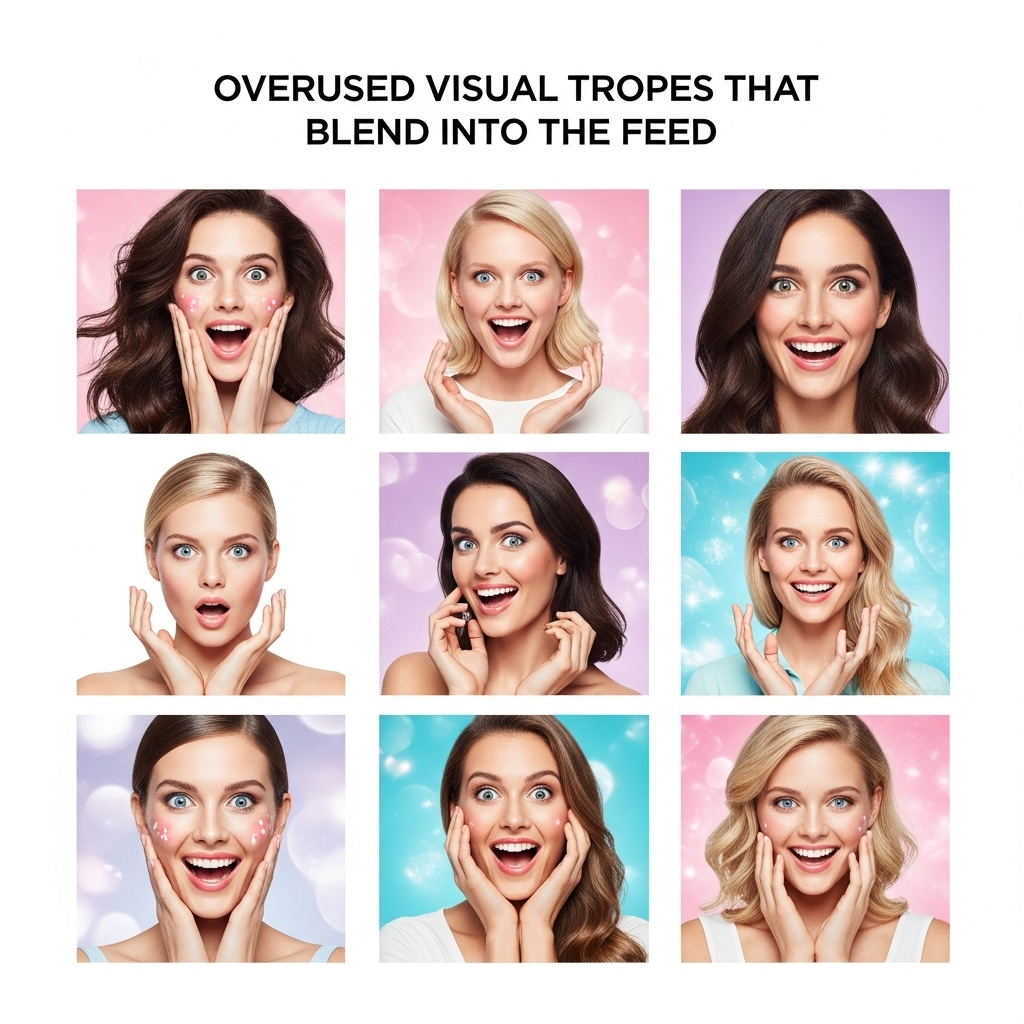
Same overused visual tropes
Think about how many times you’ve seen the same reel of lipstick being swiped, a texture smear on white marble, or a perfectly symmetrical flat-lay. These visuals used to work but audiences today are scrolling past them in less than a second.
We’re deep into what marketers call visual fatigue. Consumers aren’t just ignoring repetitive beauty tropes they’re training themselves to avoid them.
Why It Hurts Conversions:
- Feeds are saturated with copycat visuals, making your ad disappear in a sea of sameness.
- When your audience can predict what’s coming, they stop engaging.
- Repetitive frames scream “ad,” which leads to faster skips or scrolls.
How to Fix It:
- Instead of following trends blindly, build your own visual language. Use consistent colour, motion, and rhythm that feel like your brand not the trend cycle.
- Disrupt predictable layouts with unexpected visuals. Try ingredient POVs, behind-the-scenes peeks, or in-use moments from a different angle.
- Add tactile realism. A close-up of balm melting into skin or pigment puffing into air can be far more engaging than a generic swipe.
A Quick Creative Prompt:
If your competitor just launched a reel with a flat smear of foundation, how could you one-up it? Try animating your formula's reaction with light, motion, or skin warmth. Make the texture move with intent not just sit there.
Mistake 2: Static Product Imagery With No Storytelling
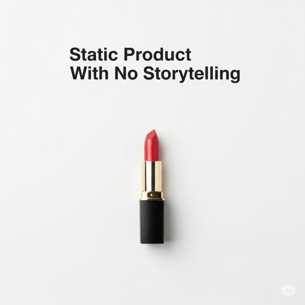
Static product
In a category built on transformation, one of the most common pitfalls is showing products in a vacuum literally. A floating serum bottle on a white background might feel clean, but it lacks any human connection or emotional payoff.
Beauty buyers want to feel what the product does, not just see it sitting pretty.
Why It Hurts Conversions:
- Flat visuals don’t showcase benefit, usage, or payoff.
- Minimalist shots often feel lifeless or forgettable, especially on video-led platforms.
- It fails to create desire or answer the core question: Why should I care?
How to Fix It:
- Put it in motion. Even subtle movement like a slow drip, gentle mist, or flowing gloss can add life.
- Use skin, not just surfaces. Show the balm smoothing on dry lips. Let a brush pick up just the right amount of powder and bounce on cheekbones.
- Play with depth and dimension. Instead of 2D flat-lays, try close-up 3D textures, or layered shots that hint at ingredients and finish.
The Emotional Trick:
Think of how the product feels cooling, creamy, gliding. Then ask: “How can I show that feeling in a single frame?” That’s your conversion hook.
Mistake 3: Visually Inconsistent Campaigns That Break Flow
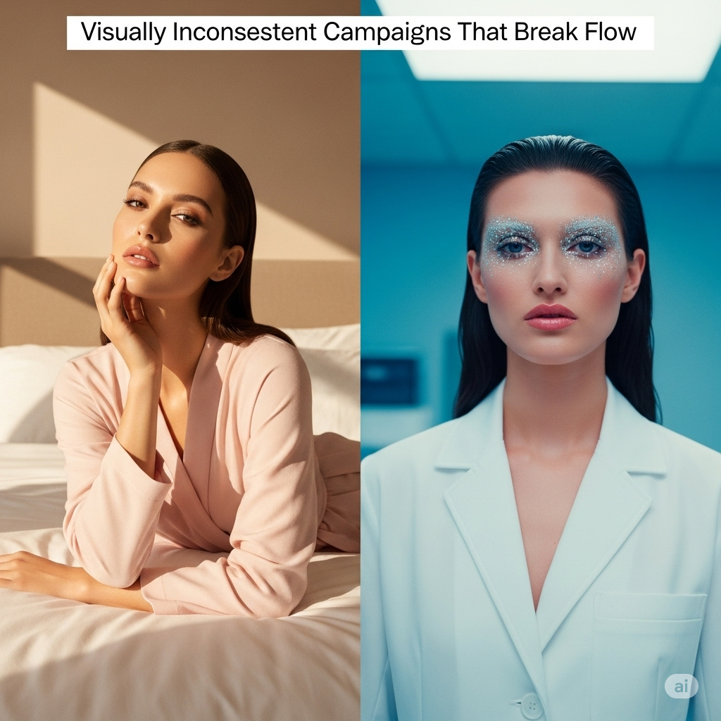
Visually Inconsistent Campaigns
This one stings because it’s sneaky. You might have strong individual creatives an eye close-up, a clean unboxing shot, a 3-second texture loop but if they don’t connect, your audience loses trust, and your funnel loses heat.
Visual inconsistency across ads (or platforms) confuses your audience more than you think. Inconsistent colour grading, animation styles, or layout logic can feel disjointed even cheap.
Why It Hurts Conversions:
- Confused viewers don’t click. They scroll away.
- It makes your brand feel scattered, reducing perceived value.
- It weakens retargeting or sequenced ad performance because viewers can’t follow the visual story.
How to Fix It:
- Define a visual system before you design a single asset. That includes brand fonts, animation speeds, brushstroke direction, even your swatch format.
- Design every ad as part of a series. Think of it like a Netflix show not a one-off. Each creative should build on the previous one.
- Test smartly. Run variations within your aesthetic, not wildly different creative directions that compete with each other.
The Cost of a Scroll-By: What You’re Really Losing
Every time someone scrolls past your ad, you’re not just losing a potential click you’re damaging your future delivery. Platforms like Meta and TikTok reward content that holds attention. When they detect viewers skipping your ads, your CPM can spike and your reach can drop.
So beyond the cosmetic, these visual mistakes have real algorithmic and economic impact. Your visuals don’t just need to look good they need to work hard.
Beauty Visuals That Convert: What Works Now
So, what does a high-performing beauty ad actually look like today?
- It opens with movement in the first second: a smear, a sparkle, a reveal.
- It shows product payoff: plumper lips, calmer skin, visible results.
- It centers the user, not just the item: hands, expressions, application moments.
- It ends with a clear visual CTA, not just a logo slap.
And most importantly it feels true to the brand. Not a borrowed trend or a forced filter, but something uniquely yours.
Real Case: Lipstick, Done Two Ways
Let’s take a lipstick launch. Two brands run video ads for their newest shade.
Brand A uses a product spin on a neutral background. Text overlay says “New shade drop.”
Brand B shows a hand applying the lipstick in natural light. You see the before and after the lips transform from dry to dewy, with soft light bouncing off the pigment. The application feels tactile, close, and real.
Same category, same product, totally different result. Brand B’s ad leads to 3x more saves and a 40% higher add-to-cart rate.
That’s the power of visual story over static product.
Admigos: Turning Scrolls into Clicks
At Admigos, we believe beauty visuals should do more than just look pretty. They should perform.
We audit beauty ads for hidden visual weaknesses like fatigue triggers, flat textures, or broken sequences and turn them into high-impact creative systems. Whether you're prepping a major launch or revamping evergreen ads, we craft visuals that move with meaning.
From brush pressure mapping to animated swatches, from soft-focus texture loops to rhythmic CTA reveals our visuals don’t just capture attention. They convert.
If your ad performance has plateaued, your creative might be the bottleneck. Admigos can fix that. Check our work at Admigos.
A Quick Fix Audit for Your Next Beauty Ad
Ask yourself:
- Does your ad hook attention in under 1.5 seconds?
- Is your visual communicating a feeling, not just a fact?
- Is your brand’s aesthetic consistent across all creatives?
- Would you stop scrolling if you saw this?
Some links you may refer to are here:-
Reels Fatigue Is Real: What Beauty Brands Should Do Instead
Struggling with reels fatigue? Discover beauty reels engagement tips and creative fixes to refresh your content strategy and boost views without burning out.

Designing for Gen Z: The Beauty Aesthetic They Actually Engage With
Design for Gen Z beauty trends in 2025 with visuals they love. Learn how Admigos decodes youth aesthetics so your brand speaks their language fluently.
.png)