Packaging Deep Dive: Why Summer Fridays Always Feels ‘Clean’
Discover how Summer Fridays packaging uses minimalism, soft labeling, and material choice to build trust. A skincare clean design case study by Admigos.
17 Jul'25
By Niharika Paswan

Packaging Deep Dive: Why Summer Fridays Always Feels ‘Clean’
Step into any beauty aisle or scroll through Instagram and you’ll spot Summer Fridays immediately.
Their packaging feels like a breath of fresh air: clean, soft, and quietly confident. But that “clean” aesthetic isn’t just about beige tubes or pastel caps. It’s the result of carefully engineered decisions around material, minimalism, and labeling all of which work together to create a sense of trust.
In the skincare space, where claims fly fast and ingredient lists are long, packaging does a lot of the talking. Summer Fridays has mastered the art of saying more by showing less. This article unpacks how they do it and why it works.
The Power of a Clean First Impression
Before consumers read a single word on the label, they’ve already formed an impression. Skincare clean design isn’t just about looking pretty. It’s about signaling values. Clean packaging tells the consumer: this product won’t overwhelm your skin, your routine, or your shelf.
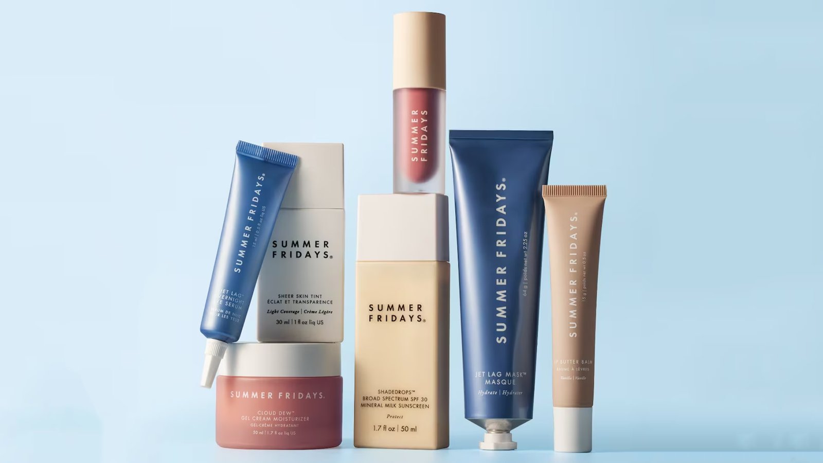
Summer Fridays leans into this logic fully. From their first hit product, the Jet Lag Mask, they’ve embraced understated elegance. No loud gradients. No shiny foil text. Just muted tones, matte finishes, and generous whitespace.
Why does that matter?
Because in skincare, minimalism = transparency. When a brand removes visual noise, it cues honesty. There’s no attempt to distract. Just the product and what it promises to do. This is especially important in a beauty world increasingly shaped by ingredient-aware, label-literate consumers who are skeptical of overclaiming. As Ellspo Eco explored in a blog, the reason Summer Fridays feels different isn’t just what’s inside the tube and how the entire product communicates quiet confidence from the outside in.
Minimalism Isn’t Empty. It’s Intentional.
The biggest misconception about minimalist design is that it’s easy. But stripping down takes more discipline than layering up. For Summer Fridays, every detail is carefully considered from the rounded edges of a cap to the ratio of font to label space.
Their visual restraint has become a signature. Look closely and you’ll see how the brand repeats certain elements across product lines: pastel shades that feel sun-faded and warm, lowercase typography that softens the tone, and sans-serif fonts that feel modern but non-clinical.
It’s a skincare clean design language that feels almost whisper-soft, never demanding attention, but always keeping it. In a space filled with loud, glossy packaging, Summer Fridays carves a different path: one that speaks in hushed tones and earns trust by understatement.
Material Matters: The Texture of Trust
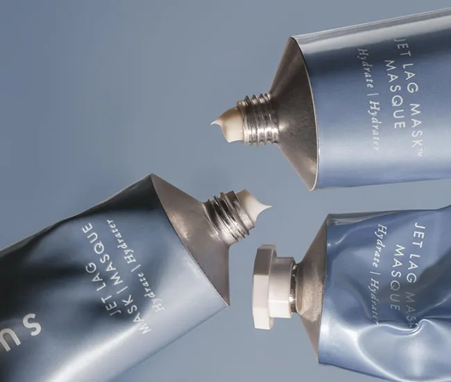
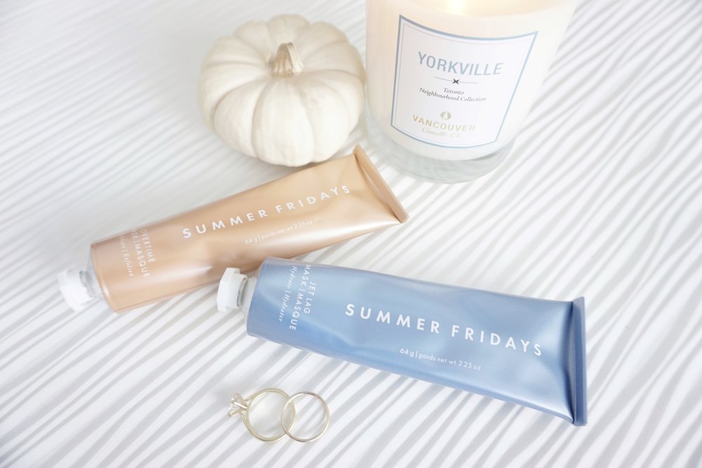
Touch is an overlooked layer in design psychology. And Summer Fridays gets it. Their iconic Jet Lag Mask came in an aluminum tube a nod to traditional apothecary creams, but with a distinctly modern twist. Unlike the shiny plastic tubes used by many competitors, this material feels artisanal, tactile, and grounded.
Even the slight crinkle as you squeeze the tube becomes part of the user experience. It’s almost nostalgic, which creates emotional connection. The matte texture of their packaging also avoids the high-gloss finishes associated with cheap or overproduced products.
There’s also a sustainability angle at play here. The move away from multi-material packaging makes recycling easier. For a younger audience that cares deeply about environmental impact, this quiet choice builds long-term brand equity. It doesn’t scream “eco-friendly,” but it communicates it silently through feel, form, and finish. For a closer look at how this product blends tactile experience with clean design cues, the official Jet Lag Mask overview by Summer Fridays breaks down its formulation, usage, and design philosophy in detail.
Labeling That Doesn’t Overpromise
One of the most subtle strengths of Summer Fridays packaging is how restrained their copy is. Their labels never shout. The product names are often metaphorical or lifestyle-linked rather than overly scientific. Take names like “Cloud Dew” or “Dream Oasis” they evoke mood and sensorial experience instead of technical claims.
That’s deliberate.
In an industry where it’s easy to say too much, Summer Fridays says just enough. Their INCI lists and claims are present but often on the back, in light gray. The front of the package is reserved for the name, maybe a key ingredient, and the product’s role (like “hydrating serum”). That’s it.
This minimal labeling approach avoids triggering the skepticism consumers now associate with overhyped skincare promises. Instead, it says: this is what it is. Try it. Trust your own skin.
The Color Psychology of Calm
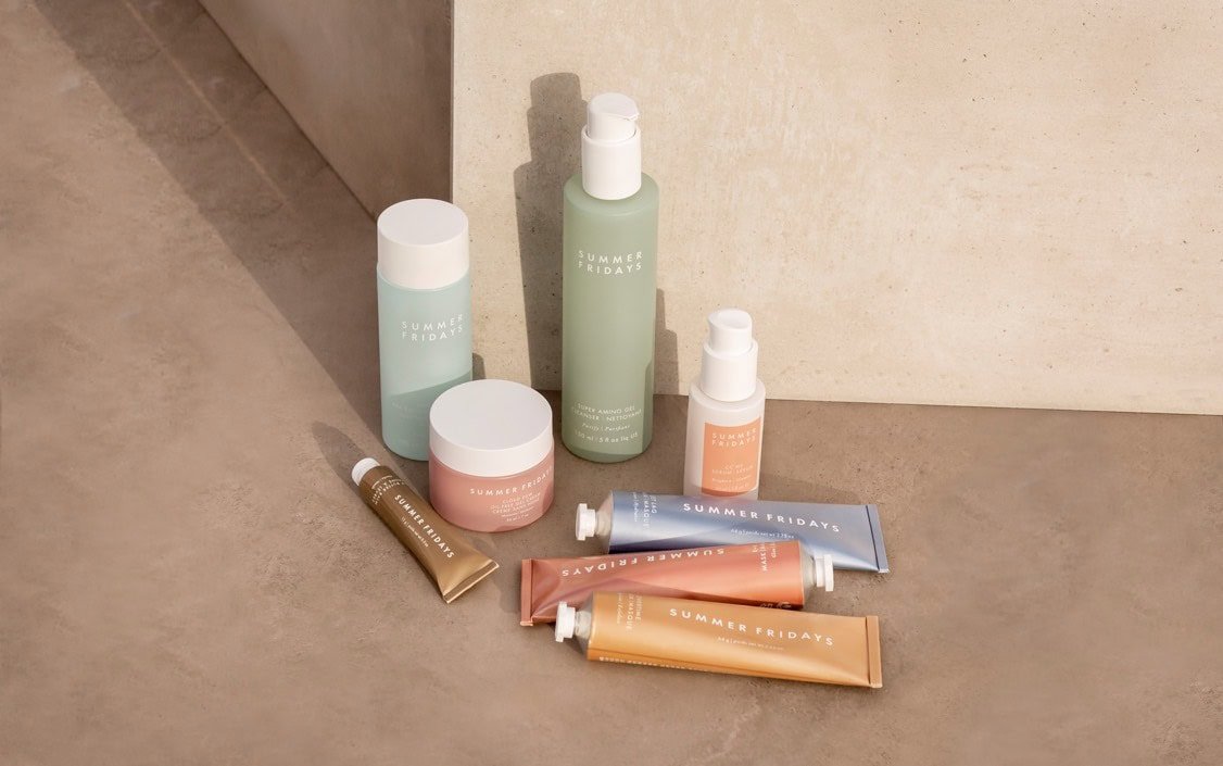
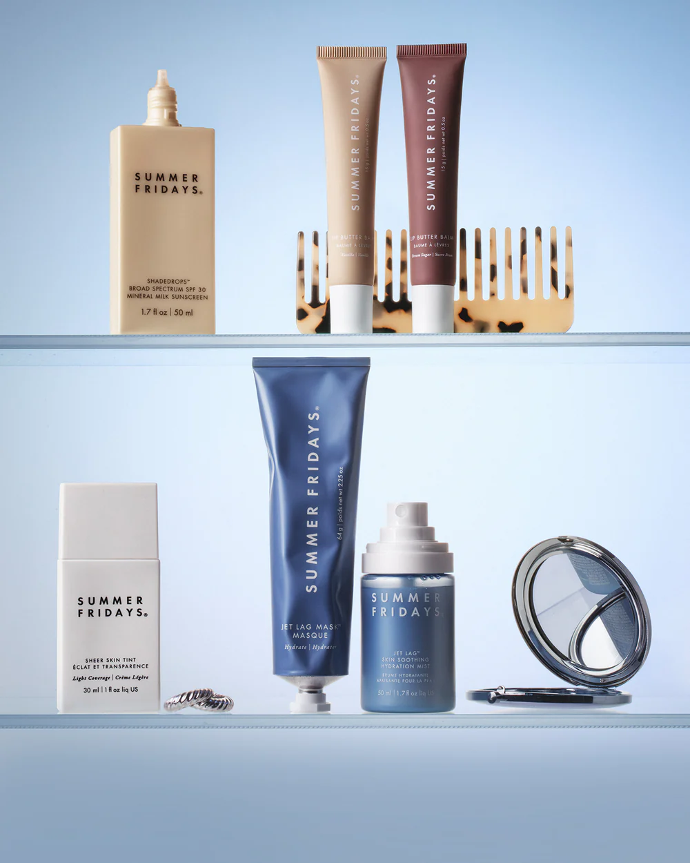
Color plays a major role in the clean feel of Summer Fridays packaging. Each SKU is color-coded, but the palette never strays too far from desaturated pastels and warm neutrals. Think oatmeal, cloud blue, dusty coral. These tones evoke softness, sun, and self-care.
Importantly, there’s a consistency across the entire brand line. No neons. No saturated jewel tones. The brand knows what emotional notes it wants to hit: calm, warmth, relaxation.
In color psychology, these hues are associated with safety and simplicity. They reduce visual anxiety and make products feel like part of a routine and not an aggressive treatment or high-stakes purchase. That’s important for skincare, where trust drives trial and repurchase.
This also plays beautifully on social. Summer Fridays packaging blends seamlessly into clean bathroom counters and curated shelfies. It invites photography, not just consumption. And that visual consistency has helped turn users into unpaid brand ambassadors.
Shape Simplicity = Shelf Memory
The physical form of packaging is often overlooked in design discussions. But it’s one of the most powerful tools for building memory. Summer Fridays keeps their shapes simple mostly tubes, cylinders, and low-profile jars.
This consistency makes their products feel like a family. There’s an architectural harmony to their lineup that helps them stand out not by being loud, but by being orderly. It’s the opposite of chaotic beauty shelves where every product looks like it came from a different brand.
These shapes also support functional use. The aluminum tube, for example, lets users control how much product they dispense. The pump bottles are compact and travel-friendly. Even the weight of the components feels thought through never cheap, always elevated.
Skincare clean design depends on consistency across touchpoints. Summer Fridays delivers this across shape, texture, and typography. Their Recycle Packaging Program invites customers to send back their empty product containers tubes, jars, caps for proper recycling, regardless of local curbside rules.
The Anti-Hype Effect: Why Subtle Wins
Summer Fridays’ clean aesthetic goes hand-in-hand with what we could call the anti-hype effect. In a market obsessed with fast virality, they’ve taken a slower, steadier route. Their packaging doesn’t chase trends it anchors the brand in timeless cues.
This is part of what makes it feel “clean.” There’s no visual chaos. No glittery text. No color-blocked panels fighting for your attention. Instead, there’s a soft sense of stability. The packaging reflects the kind of brand they want to be: nourishing, honest, easy to live with.
And that’s what builds long-term trust.
The Cultural Context of “Clean”
It’s also important to look at the word “clean” in its broader cultural context. In skincare, “clean” has moved from a formulation claim to an aesthetic code. Clean beauty isn’t just what’s inside it’s how it looks and feels.
Summer Fridays taps into this evolving definition. Their design language speaks to a generation that wants less clutter, more meaning. People now associate minimalism with ethics. Simplicity = transparency. Muted design = brand maturity.
In a time when overstimulation is the norm, a product that feels visually quiet can feel psychologically clean. And that emotional cleanliness is often more powerful than a “clean formula” badge.
Summer Fridays understands this nuance deeply and their packaging reflects that layered understanding.
Admigos: Learning From The Best to Design What’s Next
At Admigos, we study brands like Summer Fridays not to copy their aesthetic, but to decode what makes it work. Packaging isn’t just surface. It’s a silent signal of a brand’s values. When we work with beauty brands, we bring these insights into motion, form, and material strategy.
We look at how softness, repetition, and restraint create consumer trust. We analyze what materials feel elevated, what label styles communicate transparency, and how shape consistency builds brand memory.
Admigos helps beauty brands evolve their visual language by drawing from category leaders then pushing the aesthetic forward in ways that are still authentic to them.
Because in beauty, “clean” isn’t a trend. It’s a feeling. And feeling is what drives buying.
The Rise of Soft Fonts in Beauty Branding (And Why It Works)
Soft font packaging 2025 is reshaping beauty branding. Discover the psychology behind the beauty brand fonts trend and how Admigos aligns design with tone.
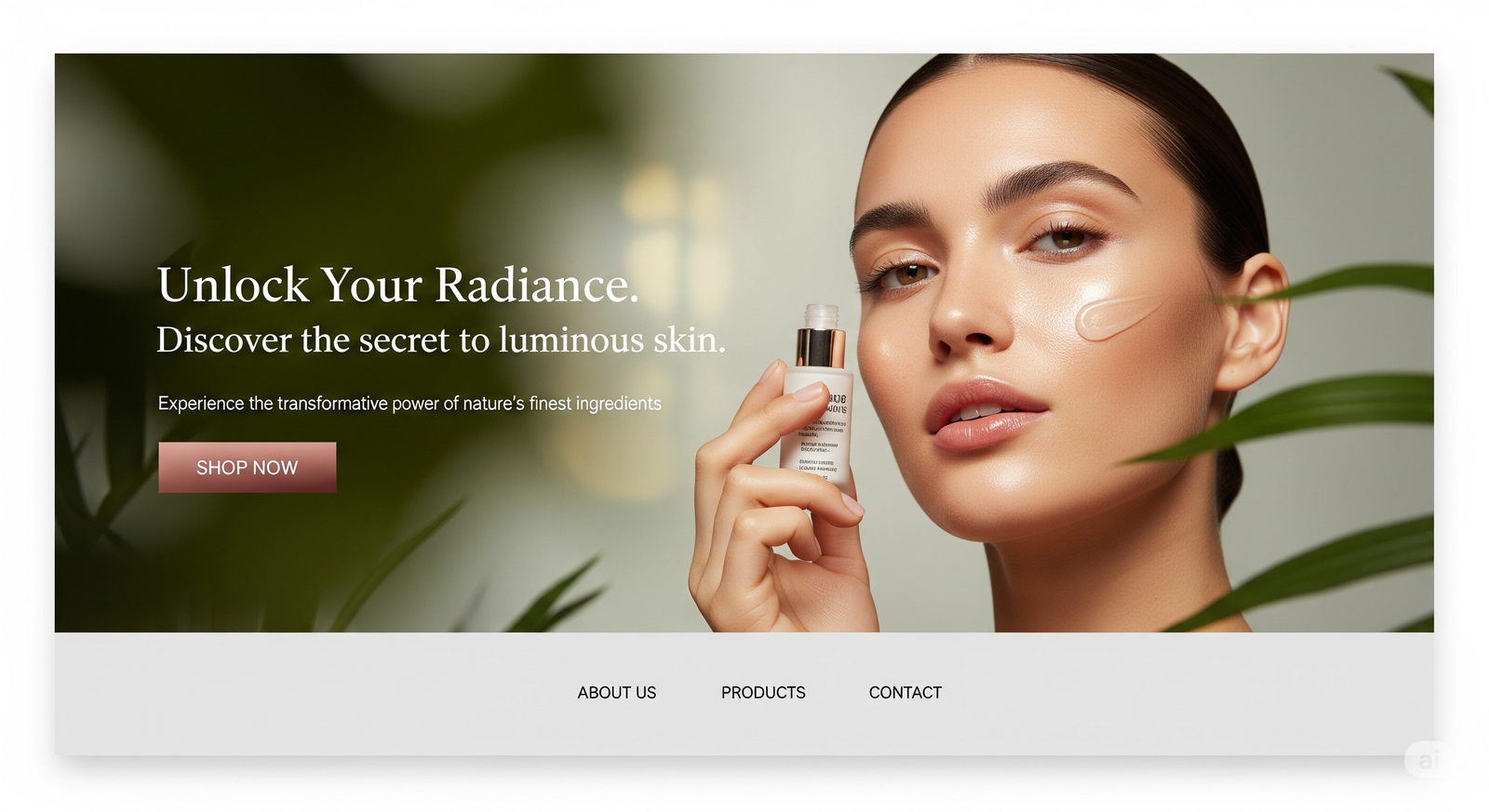
The “One Hero, One Hook” Layout Dominating Landing Pages in 2025
Explore how beauty landing page design in 2025 favors visual-first layouts. Learn why the “One Hero, One Hook” format boosts conversion for cosmetic website visuals.