
Slide vs Swipe: Why Carousel Designs Are Winning in Beauty
Discover how beauty brand carousel design boosts Instagram post engagement in 2025 through UX, thumb zone strategy, and swipe-worthy visual storytelling.
19 Jul'25
By Niharika Paswan

Slide vs Swipe: Why Carousel Designs Are Winning in Beauty
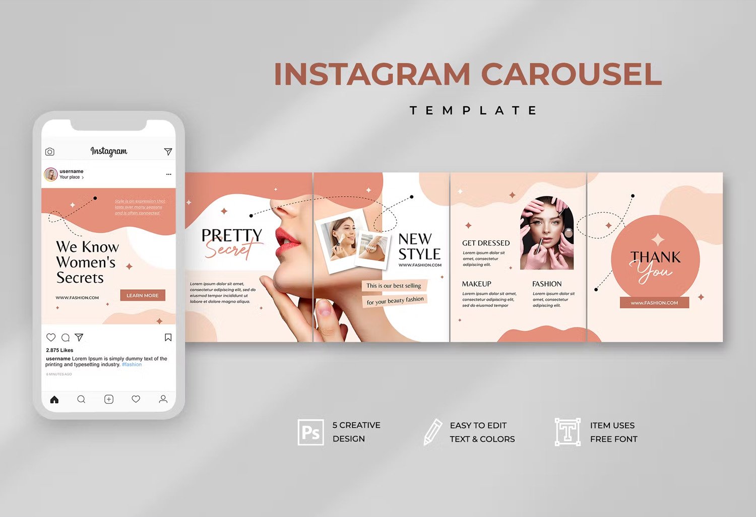
Not all posts are built to be swiped. Yet on beauty Instagram, the swipe has become a standard. Slide by slide, brands are telling stories, breaking down product claims, and pulling users deeper into a visual journey. What started as a simple format a multi-image post has evolved into a powerful UX tool. Carousel posts now drive higher engagement than almost any other format. But why?
This article explores the rise of beauty brand carousel design, the psychology behind user interaction, and how smart brands are leveraging the thumb zone to increase Instagram post engagement in 2025. It also unpacks the fatigue caused by vertical video overload and why swiping across may feel more intuitive than endlessly scrolling down.
Why Carousel Posts Outperform
The numbers say it all. Carousel posts generate up to 1.4x more engagement than single-image posts on Instagram. For beauty brands, where visuals matter more than copy, this boost in interaction is gold. But it’s not just about having more images. It’s about how those images are sequenced, spaced, and shaped. Carousels mimic the rhythm of a good story. Slide one grabs your attention. Slide two builds intrigue. Slide three delivers a payoff. And by the time you're on slide five, you’re invested.
This structure creates a micro-narrative arc that’s ideal for beauty marketing, where trust and texture need more than one frame to communicate. Instead of overwhelming the viewer with all the information in a single visual, carousels allow for slow reveal. Think before and after. Ingredient deep dives. Routine breakdowns. Texture showcases. Claims validation. The format naturally supports visual storytelling one swipe at a time.
Carousel Logic: Built for Browsing, Not Blasting
Good carousel design isn’t just a pile of images. It’s about logic. There needs to be pacing. Flow. A reason to keep sliding. Beauty brand carousel design works best when it guides the viewer rather than bombards them. In 2025, we’re seeing a shift away from text-heavy slides and toward clean layouts with visual anchors. Think product on the left, texture on the right. Or swipe-to-reveal claims that feel more like a conversation than a pitch. It's a rhythm that feels familiar almost like reading a magazine spread.
This logic works especially well for skincare brands. They can show application steps in sequence, highlight key ingredients with swipe-based education, or share real reviews without overwhelming the viewer. Makeup brands are using carousels to demonstrate shade ranges or build full-face tutorials frame by frame. The format doesn’t just tell a story it lets users choose their pace. Swipe quickly for the overview. Pause on a slide to zoom in. That flexibility makes carousel design feel more user-led than traditional posts. As Sked Social highlights in their recent insights, carousels in 2025 are less about dumping content and more about designing moments. When done right, each swipe adds value and not clutter.
Thumb Zone Design: Why Placement Matters
One reason carousels perform well is because they’re thumb-friendly. Literally. UX researchers often refer to the "thumb zone" the natural range of motion when users scroll with one hand. Swiping horizontally is less effortful than scrolling vertically, especially on larger screens. It's why people stay longer on carousels: the movement feels easier.
Beauty brand carousel design that accounts for this interaction wins attention faster. For example, placing CTA elements like “swipe to see texture” or arrows in the lower center of the frame guides the eye without disrupting the image. Keeping important text out of the top third (where thumbs rarely reach) also helps reduce friction.
Designing for the thumb zone also means using consistent margins. Viewers subconsciously crave order. If every slide feels like part of the same system, same padding, same type scale they’re more likely to swipe through the entire post. It feels smoother. Less mentally taxing. More designed. Instagram post engagement in 2025 is increasingly shaped by these small UX choices. The easier it is to interact, the longer people stay. And in social media, time = trust. The Futur offers a solid breakdown of how to approach layout, flow, and pacing for maximum impact. It’s not just about aesthetics it’s about creating content that feels easy to engage with.
Fighting Vertical Video Fatigue
We’re living in the era of vertical video. Reels, Shorts, Stories every platform wants your attention in motion. But that constant movement can backfire. It creates visual fatigue. Not every moment should bounce, zoom, or slide. And not every brand needs to be a performer. Carousels offer a calm alternative.
For beauty brands in particular, where visuals need to be aesthetic, soothing, and clear, the swipe-based format offers space. It slows the scroll. It gives a product time to breathe. Instead of flashing a cleanser for 0.5 seconds in a Reel, brands can show the tube, then the texture, then the routine all without motion, just movement. There’s also a psychological benefit. Swiping across feels less passive than watching a reel. It requires a conscious decision. That micro-effort creates a sense of participation. You’re not just watching content you’re interacting with it. That slight engagement makes the viewer more likely to remember the product and return to the post.
In short, beauty brand carousel design lets the product lead. Not the algorithm. Scott Social Marketing outlines seven easy carousel post ideas tailored for skincare brands. It’s a helpful guide for turning strategy into scroll-stopping storytelling.
From Single Post to Scroll-Stopping Sequence
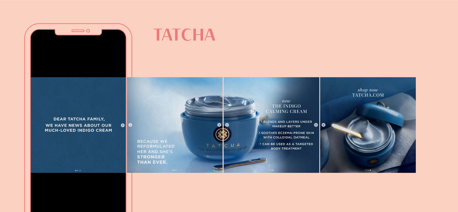
What makes a carousel scroll-stopping? It starts with the first frame. The opener needs to work like a billboard. It should have a hook visual or verbal that earns the swipe. This is where we’re seeing brands become smarter with sequencing. Slide one might tease a claim: “The cleanser that rebuilt my barrier in 7 days.” Slide two shows the product. Slide three explains the ingredients. Slide four is a texture demo. Slide five is the result.
Every swipe adds value. This kind of structured reveal is a major reason carousel content drives better Instagram post engagement in 2025. Instead of front-loading everything, it distributes information across a journey. That drip-feed of content makes users feel like they’re discovering something, not just being sold to. It also supports longer storytelling. Beauty brands can build full campaigns in a single carousel launch teasers, how-to guides, review snapshots all within one post. For audiences that skim more than they read, this format delivers clarity without sacrificing detail.
Tapping into Curiosity and Control
A major reason carousels convert? They reward curiosity. When users swipe, they’re not just looking for more visuals they’re looking for answers. The format lends itself to problem-solution narratives, which work exceptionally well in skincare and haircare. For example, a brand might open with “Still struggling with frizz?” and let the user swipe through potential causes, solutions, ingredients, and finally the hero product. That kind of interactivity creates buy-in. It builds trust. And it feels native to how people explore beauty content through questions, not just aesthetics.
Carousels also offer a sense of control. Unlike Reels, where the platform controls pacing, carousels let the viewer decide when to move. That micro-choice creates a sense of autonomy, which increases the likelihood of engagement. You’re not just watching you’re participating. This combination of curiosity and control is especially powerful on platforms like Instagram, where attention is the main currency. Beauty brand carousel design that taps into these psychological triggers earns more than likes it earns time. Haute Stock, their tips offer a quick guide on what to avoid when designing carousels that convert.
The Shift from Branding to Education
One of the biggest evolutions in beauty content is the shift from brand storytelling to user education. Consumers don’t just want to know what a product looks like they want to know how it works. Carousels are uniquely suited for this kind of breakdown. Instead of burying key information in a long caption or fast-moving video, brands can use each slide to teach. One slide for ingredients. One for usage. One for results. One for real skin. It’s the kind of modular, swipeable learning that feels effortless.
In 2025, this approach is becoming standard. Beauty brands that want to boost Instagram post engagement know that content has to inform, not just inspire. Carousels help bridge that gap educating through design without overwhelming the viewer. And when it’s done right, the post doesn’t feel like an ad. It feels like advice.
Admigos: Turning UX Thinking into Social Impact
At Admigos, we study swipe behavior like it's science. Because it is. Behind every great carousel is a logic, a design intelligence that knows how the human thumb, eye, and brain work together. We help beauty brands take their carousel design from decorative to strategic. That means thinking about sequence, spacing, swipe momentum, and narrative flow.
We apply UX principles like thumb zone optimization and visual pacing to build social content that doesn’t just look good, but performs. Whether it’s creating ingredient explainers that land or sequencing visuals that increase post saves, Admigos brings storytelling and interaction together. We design carousels that people actually want to finish. Because when your audience reaches slide 10, that’s not the end of the post. That’s the start of brand recall.
In 2025, beauty brands that think like designers and storytellers will win the swipe. Admigos is here to help them do both.
The “One Hero, One Hook” Layout Dominating Landing Pages in 2025
Explore how beauty landing page design in 2025 favors visual-first layouts. Learn why the “One Hero, One Hook” format boosts conversion for cosmetic website visuals.
Avoiding SKU Overload: Smarter Launches for Beauty Brands
Avoid beauty SKU overload with smarter product launch strategies. Learn how to fix portfolio mistakes and improve your brand’s growth using data-driven insights.
